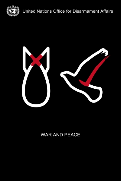
Poster one
I chose this poster because I felt that it clearly represented what it was trying to say. There were few words on this poster but there really didn't need to be much more than there are because it shows that nuclear weapons and war are not good and should be gotten rid of and then the dove represents the sign of peace and if you couldn't tell that already it shows it clearly underneath. The red cross and tick draw your eyes to the middle of the page because they are the only colours on the page standing out against the black and white. The poster does come across with a good message that is clearly stated but it doesn't really have any information on how these people are going to get rid of the nuclear weapons. I'm not sure if it was supposed to be a vote or just a suggestion but the poster doesn't provide any more information and it should so people aren't left confused as to what is going to happen.
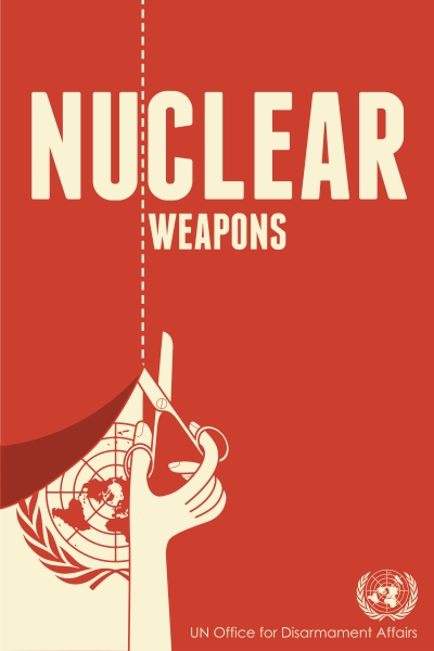
Poster two
I chose this poster because it's getting the message across quite well that the UN Office for Disarmament Affairs wants to get rid of nuclear weapons. The poster has the background of red which is a colour that, if it had been on a wall or something like that, would've made it stand out quite well. When I look at this poster my eyes instantly go to the word nuclear and then my one of vision follows down the line of the scissors where you can see the UN Offices logo. At the top of the page the scissors line cuts through the word nuclear making it look like soon it will just be the word clear which shows they want to clear the UN of all nuclear weapons. Although this poster is good it also doesn't show if it's just a message or if it's something more. I think these posters are just supposed to be a message though which would mean that it is fairly clear what whoever made the poster was going for.
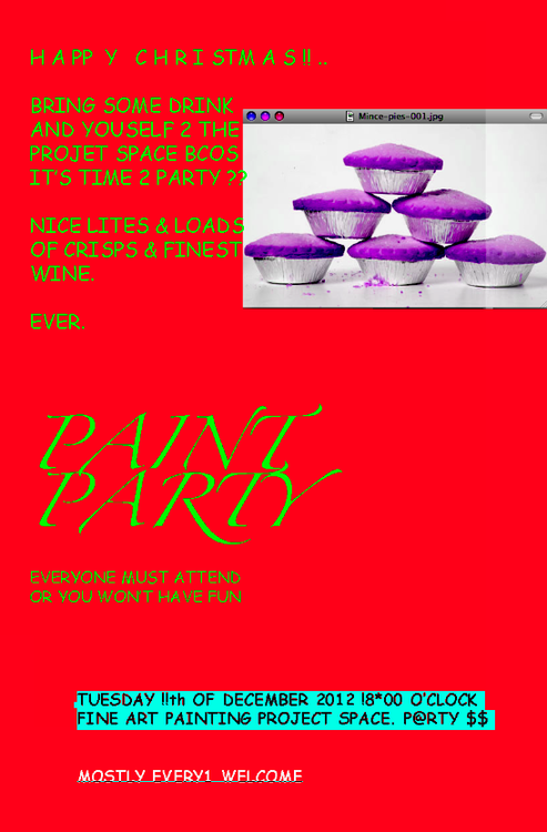
Badly designed poster
This poster is poorly designed because formally reasons. I think the main reason it's so badly designed is because of the colour choice. The red background makes it really hard to concentrate on the neon green writing and from a distance its almost not possible to read the writing. Its also quite difficult to read considering whoever made this has used the number 2 instead of to and the rest of the grammar doesn't seem to be very good. At the bottom of the page the writing colour changes which almost would've been a good idea until you see the actual way they've typed it, there are unnecessary exclamation marks all over the place and with the dollar signs at the end it makes it unclear if you should bring money to this thing or not. Down the very bottom it has a little more writing in yet another colour which would've been fine but they've underlined it in a light blue colour which makes it really hard to see the bottom of the letters so therefore you can't tell if the letters are e's or f's. Another thing that makes this poster badly designed is the random picture of mince pies. There is no other mention of the mince pies on the poster and the actual picture itself goes over the end of some of the writing. For poster for fine painting, which also was fairly unclear, this has been very poorly designed considering the people who made it were probably artists.
UN DISARMAMENT
- Why is this issue important?
- What are some of the factors that make this issue important to
- What is the message that you will try to communicate through your work
- What is being done to support or respond to this issue?
